**So we changed our logo …
First I want to talk a bit about the old logo what it represented and why it was selected.
Our old logo cost about £50 i asked for a logo and gave some examples one of which included my hand on a piece of paper with a heart around it.
I really wanted something that could fit easily on physical products a bit like the fair trade logo. Also I wanted to highlight the darker side of Causevest the fact that we have both a light side and a dark side.
That each segment of our network was captured by a different finger and ultimately that the power to do good is in our hands.

In short everyone hated it XD

But it was hard to challenge it since i defended it so well. In fact it was many of them that also gave the logo the heads up originally.
It was until a meeting with Image Director JC that the great logo war began. JC created us a brand guide as i was concerned about having so many people working on design work without any reference to a set style. He gave some interesting logo examples that included textures and really improved the front of our original website. Unfortunately i just wasn’t feeling the logo options.

I used his guidance however to help select the new logo… which in fact wasn’t selected at all we had over 40 logos to choose from.
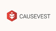
Now then I have a question for you when you look at this logo what do you see ?
Many people have different thoughts that most interesting I have heard is the that they see a lady in a bikini, others see just a fancy shape in fact i have even heard that it looks like a squashed *****
So when I first saw it I thought of it looks nice it’s a nice shape then moved on.
It was only when i asked the creator what was he trying to capture or show when he created this design that my mind was blown away. It’s a love heard with someone arms around it he said i tried to capture the idea of giving you body heart and soul to the world you love while also keeping a corporate and professional style.
He was the only designer who captured everything i requested and i fell in love with the fact that it requires you to really look at the logo to figure out the message.
So we hope you like our new logo!

